
PyNGL > tutorial examples > 1 | 2 | 3 | 4 | 5 | 6 | 7 | 8 | 9 | 10 | 11
Example 11 - contour and XY plot
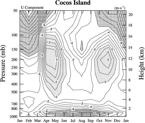
This example reads an ASCII file containing monthly climatological zonal winds for Cocos Island, and creates a contour plot of these winds and a multi-curve XY plot of the values at each level.There are two ways to run this example:
execute
pynglex ngl11p
or
download
ngl11p.pyand then type:
python ngl11p.py
Output from example 11
| Frame 1 | Frame 2 |
|---|---|
| 
|
(Click on either frame to see it enlarged.)
  0. #
  1. #  Import NumPy.
  2. #
  3. import numpy,sys
  4.
  5. #
  6. #  Import NGL support functions.
  7. #
  8. import Ngl
  9.
 10. #
 11. #  Define a color table and open a workstation.
 12. #
 13. cmap = numpy.zeros((2,3),'f')
 14. cmap[0] = [1.,1.,1.]
 15. cmap[1] = [0.,0.,0.]
 16. rlist = Ngl.Resources()
 17. rlist.wkColorMap = cmap
 18. wks_type = "ps"
 19. wks = Ngl.open_wks(wks_type,"ngl11p",rlist)
 20.
 21. dirc     = Ngl.pynglpath("data")
 22. data     = Ngl.asciiread(dirc+"/asc/u.cocos",(39,14),"float")
 23.
 24. pressure  = data[:,0]    # First column of data is pressure (mb).
 25. height    = data[:,1]    # Second column is height (km).
 26. u         = data[:,2:14] # Rest of columns are climatological zonal winds
 27.                            # (u: m/s)
 28. unew =  Ngl.add_cyclic(u)  # Add cyclic points to u.
 29.
 30. #----------- Begin first plot -----------------------------------------
 31.
 32. resources = Ngl.Resources()
 33.
 34. resources.tiMainString   = "~F26~Cocos Island"   # Main title.
 35. resources.tiYAxisString  = "~F25~Pressure (mb)"  # Y axes label.
 36.
 37. resources.sfYCStartV = max(pressure)   # Indicate start and end of left
 38. resources.sfYCEndV   = min(pressure)   # Y axes values.
 39.
 40. resources.trYReverse  = True    # Reverse the Y values.
 41. resources.trYLog      = True    # Use log scale.
 42.
 43. resources.tmXBMode      = "Explicit"   # Define your own tick mark labels.
 44. resources.tmXBLabelFont = "times-roman"      # Change font of labels.
 45. resources.tmXBLabelFontHeightF = 0.015 # Change font height of labels.
 46. resources.tmXBMinorOn   = False        # No minor tick marks.
 47. resources.tmXBValues    = range(0,13,1) # Location to put tick mark labels
 48.                                          # (13 points with January repeated).
 49. resources.tmXBLabels    = ["Jan","Feb","Mar","Apr","May","Jun",\
 50.                            "Jul","Aug","Sep","Oct","Nov","Dec","Jan"]
 51.
 52. resources.tmYUseLeft    = False      # Keep right axis independent of left.
 53. resources.tmYRLabelsOn  = True       # Turn on right axis labels.
 54. resources.tmYRLabelFont = "times-roman"   # Change font of labels.
 55. resources.tmYROn        = True       # Turn on right axis tick marks.
 56. resources.tmYRMinorOn   = False      # No minor tick marks.
 57.
 58. resources.tmYRMode      = "Explicit"  # Define own tick mark labels.
 59. hnice = range(0,23,2)                 # Set range of "nice" height values.
 60. pnice = Ngl.ftcurv(height,pressure,hnice) # Calculate "nice" pressure values.
 61. resources.tmYRValues    = pnice       # At each "nice" pressure value,
 62. resources.tmYRLabels    = hnice       # put a "height" value label.
 63.
 64. resources.tmYLMode      = "Explicit" # Define own tick mark labels.
 65. resources.tmYLLabelFont = "times-roman"   # Change the font.
 66. resources.tmYLValues    = [1000.,  800., 700., 500., 400., 300., \
 67.                                250.,  200., 150., 100.,  50.]
 68. resources.tmYLLabels    = ["1000","800","700","500","400","300", \
 69.                                "250","200","150","100", "50"]
 70. resources.tmYLMinorOn   = False        # No minor tick marks.
 71.
 72. resources.cnFillOn          = True  # Turn on contour level fill.
 73. resources.cnMonoFillColor   = True  # Use one fill color.
 74. resources.cnMonoFillPattern = False # Use multiple fill patterns.
 75.
 76. resources.cnLineLabelAngleF = 0. # Draw contour line labels right-side up.
 77. resources.cnLevelSpacingF   = 1.0
 78.
 79. resources.nglDraw  = False  # Don't draw the plot or advance the
 80. resources.nglFrame = False  # frame in the call to Ngl.contour.
 81.
 82. resources.nglMaximize = False
 83. resources.pmLabelBarDisplayMode = "Never"    # Turn off label bar.
 84. contour = Ngl.contour(wks, unew, resources)  # Create a contour plot.
 85.
 86. levels = Ngl.get_float_array(contour,"cnLevels")
 87.
 88. patterns = numpy.zeros((len(levels)+1),'i')
 89. patterns[:] = -1
 90.
 91. for i in xrange(len(levels)):
 92.   if (levels[i] <= -6.):
 93.     patterns[i] = 5
 94.   else:
 95.     if (levels[i] > 0.):
 96.       patterns[i] = 17.
 97. patterns[-1]  = 17 # last pattern
 98.
 99. rlist = Ngl.Resources()
100. rlist.cnFillPatterns = patterns
101. rlist.cnFillScaleF = 0.8
102. Ngl.set_values(contour,rlist)
103.
104. Ngl.draw(contour)  # Draw the contour plot.
105.
106. txres               = Ngl.Resources()    # Annotate plot with some text.
107. txres.txFontHeightF = 0.015
108. Ngl.text_ndc(wks,"~F25~U Component",  .270,.815,txres)
109. Ngl.text_ndc(wks,"~F25~(m-s~S~-1~N~)",.765,.815,txres)
110.
111.
112. txres.txFontHeightF = 0.025   # Label right Y axis.
113. txres.txAngleF      = 90.
114. Ngl.text_ndc(wks,"~F25~Height (km)",.89,.5,txres)
115.
116. Ngl.frame(wks) # Advance the frame.
117.
118. #----------- Begin second plot -----------------------------------------
119.
120. del resources
121. resources = Ngl.Resources()
122.
123. resources.tiMainString  = "~F26~Cocos Island"
124. resources.tiXAxisString = "~F25~Month"
125. resources.tiYAxisString = "~F25~Amplitude (m/s)"
126.
127. resources.tmXBMode      = "Explicit"   # Define your own tick mark labels.
128. resources.tmXBLabelFont = "times-roman"       # Change font of labels.
129. resources.tmXBLabelFontHeightF = 0.015 # Change font height of labels.
130. resources.tmXBMinorOn   = False        # No minor tick marks.
131. resources.tmXBValues    = range(0,13,1)# Values from 0 to 12.
132. resources.tmXBLabels    = ["Jan","Feb","Mar","Apr","May","Jun",\
133.                            "Jul","Aug","Sep","Oct","Nov","Dec","Jan"]
134. resources.tmYLLabelFont = "times-roman"      # Change font of labels.
134.
135. xy = Ngl.xy(wks,range(0,13,1),unew,resources) # Create and draw an XY plot.
136.
137. Ngl.end()
Explanation of example 11
Lines 21-27:
  dirc     = Ngl.pynglpath("data")
  data     = Ngl.asciiread(dirc+"/asc/u.cocos",(39,14),"float")

  pressure  = data[:,0]    # First column of data is pressure (mb).
  height    = data[:,1]    # Second column is height (km).
  u         = data[:,2:14] # Rest of columns are climatological zonal winds
                             # (u: m/s)
The data in the ASCII file "u.cocos" are in 14 columns by 39 rows, where the first column contains pressure values (millibars), the second column contains height values (kilometers), and columns 3-14 contain the zonal wind values (m/s). Columns 3-14 represent months of the year.
Read these values with the function Ngl.asciiread into a 2-dimensional NumPy float array called data that is dimensioned 39 x 14, and then extract the first two columns of data to 1-dimensional float arrays pressure and height, and the rest of the columns to a 2-dimensional array u (dimensioned 39 x 12).
unew = Ngl.add_cyclic(u) # Add cyclic points to u.
Using the function add_cyclic that you defined above, add a "cyclic" point to u and call the new array unew. Since the dimension of u is 39 x 12, unew will be dimensioned 39 x 13.
#----------- Begin first plot -----------------------------------------
Draw a contour plot of unew. Label the left Y axis with pressure values (using log scaling), the right Y axis with height values (using linear scaling), and the X axis with strings representing the months of the year. Fill the contour levels that are less than -6.0 with one pattern, the contour levels greater than 0.0 with another pattern, and leave the contour levels between values -6.0 and 0.0 unfilled.
  resources.sfYCStartV = max(pressure)   # Indicate start and end of left
  resources.sfYCEndV   = min(pressure)   # Y axes values.
Set these two resources to indicate the minimum and maximum values of the Y axis.
  resources.trYReverse  = True    # Reverse the Y values.
  resources.trYLog      = True    # Use log scale.
Set the Transformation resource trYReverse to True to reverse the Y axis values, and the LogLinTransformation trYLog resource to True to indicate you want log scaling in the Y direction.
Transformation resources are described in more detail in example 7.
  resources.tmXBMode      = "Explicit"   # Define your own tick mark labels.
  resources.tmXBLabelFont = "times-roman"  # Change font of labels.
  resources.tmXBLabelFontHeightF = 0.015 # Change font height of labels.
  resources.tmXBMinorOn   = False        # No minor tick marks.
  resources.tmXBValues    = range(0,13,1) # Location to put tick mark labels
                                           # (13 points with January repeated).
  resources.tmXBLabels    = ["Jan","Feb","Mar","Apr","May","Jun",\
                             "Jul","Aug","Sep","Oct","Nov","Dec","Jan"]
By setting the TickMark resource tmXBMode to "Explicit", PyNGL uses the array resource tmXBValues to determine the coordinate positions of the major tick marks, and tmXBLabels to determine the labels to put at each of the coordinate positions specified by tmXBValues. In the lines above, you are indicating you want major tick marks at values 0, 1, 2, . . ., 12 on the X axis, and the labels "Jan, "Feb", "Mar", . . ., "Jan" at each of these tick marks.
Note: You must set the tick mark values in the same data space that you have set up the corresponding axis to be. Since you did not explicitly define the limits of the X axis, the minimum value defaults to 0 and the maximum value defaults to n-1, where n is the number of points in the X direction. In this case, n is 13 because in the call to Ngl.contour below, you are contouring unew which has 13 points in the X direction.
  resources.tmYUseLeft    = False      # Keep right axis independent of left.
  resources.tmYRLabelsOn  = True       # Turn on right axis labels.
  resources.tmYRLabelFont = "times-roman"  # Change font of labels.
  resources.tmYROn        = True       # Turn on right axis tick marks.
  resources.tmYRMinorOn   = False      # No minor tick marks.
Set tmYRLabelsOn and tmYROn to True to label the right Y axes (which by default is not labeled at all). By default, if you set these resources to True, then whatever you set for the left Y axis is done for the right Y axis. To make the right Y axis independent of the left Y axis, set tmYUseLeft to False.
The resources tmYRLabelFont and tmYRMinorOn change the font and turn off minor tick marks for the right Y axis.
  resources.tmYRMode      = "Explicit"  # Define own tick mark labels.
  hnice = range(0,23,2)                 # Set range of "nice" height values.
  pnice = Ngl.ftcurv(height,pressure,hnice) # Calculate "nice" pressure values.
  resources.tmYRValues    = pnice       # At each "nice" pressure value,
  resources.tmYRLabels    = hnice       # put a "height" value label.
The height values read in from the data file are specified at decreasing and unequally spaced pressure values. Use the Fitgrid routine Ngl.ftcurv, to interpolate the pressure values at equally spaced height values.
The first argument of Ngl.ftcurv is a 1-dimensional NumPy array (or Python list or tuple) of any size (npts) containing the abscissae for the input function, and the second argument is a 1-dimensional NumPy array (or Python list or tuple) containing the npts functional values of the input function. The third argument is a 1-dimensional NumPy array (or Python list or tuple) of size npts2 containing the abscissae for the interpolated values. In this case, you are passing hnice for the third argument, which contains 12 equally spaced values from 0 to 22 in increments of 2. These "nice" height values are used because the actual height values go from 0.11 to 20.66. Ngl.ftcurv returns a 1-dimensional NumPy array of size npts2 that contains the interpolated function values at the points specified by the third argument passed to it.
Now that you have interpolated pressure values at "nice" height values, use these two arrays to specify the locations and labels for the tick marks on the right Y axis.
  resources.tmYLMode      = "Explicit" # Define own tick mark labels.
  resources.tmYLLabelFont = "times-roman"  # Change the font.
  resources.tmYLValues    = [1000.,  800., 700., 500., 400., 300., \
                                 250.,  200., 150., 100.,  50.]
  resources.tmYLLabels    = ["1000","800","700","500","400","300", \
                                 "250","200","150","100", "50"]
  resources.tmYLMinorOn   = False        # No minor tick marks.
Set tmYLMode to "Explicit" to set the tick marks and labels for the left Y axis using the resource arrays tmYLValues and tmYLLabels.
  resources.cnFillOn          = True  # Turn on contour level fill.
  resources.cnMonoFillColor   = True  # Use one fill color.
  resources.cnMonoFillPattern = False # Use multiple fill patterns.
Turn on contour fill and indicate that you want multiple fill patterns instead of solid fill.
resources.cnLineLabelAngleF = 0. # Draw contour line labels right-side up.
Set cnLineLabelAngleF to 0.0 to keep the contour line labels from being rotated. This resource has a default of -1.0, which causes line labels to be angled in the direction of the tangent of the contour line at the location of the label.
resources.cnLevelSpacingF = 1.0
Set the contour level spacing to 1.0.
resources.nglDraw = False # Don't draw the plot or advance the
The resource nglDraw is another resource that is specific to the Ngl.* suite of plotting functions. By setting this to True, you are indicating that you don't want the plotting function (Ngl.contour in this case) to draw the plot. This is done so that you can retrieve a resource from the plot after it is created and set some other resources based on the one you retrieved (more on this below) before drawing the contour plot.
resources.nglFrame = False # frame in the call to Ngl.contour.
Since you don't want Ngl.contour to draw the plot, you don't want it to advance the frame either, so set nglFrame to False.
resources.nglMaximize = False
If set to True, then the plot drawn will be maximized in the workstation on which it is being drawn. For an X11 window or an NCGM file, this means the plot will be expanded to fill the biggest possible space within a square, with a small margin around all edges. The aspect ratio will be preserved. For a PostScript or PDF file, the plot will be expanded to fill the biggest possible space on an 8 1/2" x 11" sheet of paper. You can change the default paper size or orientation with the resources nglPaperOrientation, nglPaperMargin, nglPaperWidth, and nglPaperHeight.
Turning nglMaximize off (setting it to False) will constrain the plot to have additional white space on the margins. This above line illustrates how to turn nglMaximize off, and this will be used to position text outside the plot boundaries by using Ngl.text_ndc.
contour = Ngl.contour(wks, unew, resources) # Create a contour plot.
Create a contour plot of unew. Since you set nglDraw to False, no plot is drawn at this point.
levels = Ngl.get_float_array(contour,"cnLevels")
Now that you've created the contour plot, retrieve the contour level values (cnLevels) that were calculated based on the data you passed to Ngl.contour. The Ngl.get_xx functions are described in detail in example 4.
  patterns = numpy.zeros((len(levels)+1),'i')
  patterns[:] = -1
As described in example 5, there is always one more fill area than there are contour levels. Create a new integer array called patterns that contains one more element than the levels array that you retrieved with Ngl.get_float_array, and use it to specify the fill patterns that you want for each level. You are initializing this array to pattern index -1 (transparent),
  for i in xrange(len(levels)):
    if (levels[i] <= -6.):
      patterns[i] = 5
    else:
      if (levels[i] > 0.):
        patterns[i] = 17.
  patterns[-1]  = 17 # last pattern
You are setting the pattern to index 5 (a cross hatch pattern) if the corresponding contour level value is less than or equal to -6.0, and to index 17 (a stipple pattern) if the corresponding contour level value is greater than 0.0.
  rlist = Ngl.Resources()
  rlist.cnFillPatterns = patterns
  rlist.cnFillScaleF = 0.8
  Ngl.set_values(contour,rlist)
Now that you have filled the patterns array with the fill pattern indices that you want for the various contour levels, set the cnFillPatterns resource to this array and to change the default value of cnFillScaleF FROM 1.0 to 0.8 to make the patterns more dense. The PyNGL function Ngl.set_values allows you to set values of resources associated with an object after it has been created.
Ngl.draw(contour) # Draw the contour plot.
Now draw the contour plot.
  txres               = Ngl.Resources()    # Annotate plot with some text.
  txres.txFontHeightF = 0.015
  Ngl.text_ndc(wks,"~F25~U Component",  .270,.815,txres)
  Ngl.text_ndc(wks,"~F25~(m-s~S~-1~N~)",.765,.815,txres)
Put two titles at the top of the plot (one on the left and one on the right) with calls to Ngl.text_ndc. The partial string "~F25" is a text function code that changes the font to "Times-Roman".
  txres.txFontHeightF = 0.025   # Label right Y axis.
  txres.txAngleF      = 90.
  Ngl.text_ndc(wks,"~F25~Height (km)",.89,.5,txres)
Label the right Y axis with a call to Ngl.text_ndc. By setting txAngleF to 90.0, you are rotating the string 90 degrees counter-clockwise (the default is no rotation).
#----------- Begin second plot -----------------------------------------
Create an XY plot to draw slices of the unew data.
  del resources
  resources = Ngl.Resources()
Since the resources you previously set were for a contour plot, start over with a new list of resources for an XY plot.
  resources.tmXBMode      = "Explicit"   # Define your own tick mark labels.
  resources.tmXBLabelFont = "times-roman"  # Change font of labels.
  resources.tmXBLabelFontHeightF = 0.015 # Change font height of labels.
  resources.tmXBMinorOn   = False        # No minor tick marks.
  resources.tmXBValues    = range(0,13,1)# Values from 0 to 12.
  resources.tmXBLabels    = ["Jan","Feb","Mar","Apr","May","Jun",\
                             "Jul","Aug","Sep","Oct","Nov","Dec","Jan"]
Label the X axis with strings indicating the month of the year, just as you did for the contour plot in this example.
xy = Ngl.xy(wks,range(0,13,1),unew,resources) # Create and draw an XY plot.
To draw slices of unew at every Y value in unew, just pass the whole unew array to the Ngl.xy routine. The X values that you are plotting unew against are just the months of the year, so use range(0,13,1) to pass in X values of 0, 1, . . ., 12.