
PyNGL > tutorial examples > 1 | 2 | 3 | 4 | 5 | 6 | 7 | 8 | 9 | 10 | 11
Example 1 - XY plots
This example creates five XY plots. The first four plots use data generated within the Python script, and the fifth plot uses data read from an ASCII file.The first plot has one curve, and the rest of the plots have multiple curves. Each plot has some aspect changed from the previous plot, like titles and line labels added, line colors and thicknesses changed, and markers added. More complex XY plots are shown in later examples. Please note that the words "line" and "curve" are used interchangeably in this example to refer to curves in an XY plot.
To run this example, you must have Numerical Python installed in your Python implementation. Numerical Python (also known as "NumPy") is a Python module allowing for efficient array processing.
There are two ways to run this example:
execute
pynglex ngl01p
or
download
ngl01p.pyand type:
python ngl01p.py
Output from example 1
| Frame 1 | Frame 2 | Frame 3 | Frame 4 | Frame 5 |
|---|---|---|---|---|
| 
| 
| 
| 
|
(Click on any frame to see it enlarged.)
  0. #
  1. #  Import numpy.
  2. #
  3. import numpy
  4.
  5. #
  6. #  Import Ngl support functions.
  7. #
  8. import Ngl
  9.
 10. #
 11. #  Define coordinate data for an XY plot.
 12. #
 13. x = [10., 20.00, 30., 40.0, 50.000, 60.00, 70., 80.00, 90.000]
 14. y = [ 0.,  0.71,  1.,  0.7,  0.002, -0.71, -1., -0.71, -0.003]
 15.
 16. wks_type = "ps"
 17. wks = Ngl.open_wks(wks_type,"ngl01p")  # Open a workstation.
 18.
 19. plot = Ngl.xy(wks,x,y)   # Draw an XY plot.
 20.
 21. #
 22. #  Define three curves for an XY plot.  Any arrays in PyNGL codes
 23. #  that are not 1-dimensional must be NumPy arrays.  A 1-dimensional
 24. #  array can be a Python list, a Python tuple, or a NumPy array.
 25. #
 26. #----------- Begin second plot -----------------------------------------
 27.
 28. y2 = numpy.array([[0., 0.7, 1., 0.7, 0., -0.7, -1., -0.7, 0.],  \
 29.                   [2., 2.7, 3., 2.7, 2.,  1.3,  1.,  1.3, 2.],  \
 30.                   [4., 4.7, 5., 4.7, 4.,  3.3,  3.,  3.3, 4.]], \
 31.                   'f')
 32.
 33. #
 34. #  Set resources for titling.
 35. #
 36. resources = Ngl.Resources()
 37. resources.tiXAxisString = "X"
 38. resources.tiYAxisString = "Y"
 39.
 40. plot = Ngl.xy(wks,x,y2,resources)    # Draw the plot.
 41.
 42. #----------- Begin third plot -----------------------------------------
 43.
 44. resources.xyLineColors        = [189,107,24]  # Define line colors.
 45. resources.xyLineThicknesses   = [1.,2.,5.]    # Define line thicknesses
 46.                                               # (1.0 is the default).
 47.
 48. plot = Ngl.xy(wks,x,y2,resources)
 49.
 50. #---------- Begin fourth plot ------------------------------------------
 51.
 52. resources.tiMainString    = "X-Y plot"  # Title for the XY plot
 53. resources.tiXAxisString   = "X Axis"    # Label for the X axis
 54. resources.tiYAxisString   = "Y Axis"    # Label for the Y axis
 55. resources.tiMainFont      = "Helvetica" # Font for title
 56. resources.tiXAxisFont     = "Helvetica" # Font for X axis label
 57. resources.tiYAxisFont     = "Helvetica" # Font for Y axis label
 58.
 59. resources.xyMarkLineModes = ["Lines","Markers","MarkLines"]
 60. resources.xyMarkers       = [0,1,3]     # (none, dot, asterisk)
 61. resources.xyMarkerColor   = 107         # Marker color
 62. resources.xyMarkerSizeF   = 0.03        # Marker size (default
 63.                                           # is 0.01)
 64.
 65. plot = Ngl.xy(wks,x,y2,resources)       # Draw an XY plot.
 66.
 67. #---------- Begin fifth plot ------------------------------------------
 68.
 69. filename = Ngl.pynglpath("data") + "/asc/xy.asc"
 70. data     = Ngl.asciiread(filename,(129,4),"float")
 71.
 72. #
 73. #  Define a two-dimensional array of data values based on
 74. #  columns two and three of the input data.
 75. #
 76. uv = numpy.zeros((2,129),'f')
 77. uv[0,:] = data[:,1]
 78. uv[1,:] = data[:,2]
 79.
 80. #
 81. #  Use the first column of the input data file (which is simply the
 82. #  row number) for longitude values.  The fourth column of data is
 83. #  not used in this example.
 84. #
 85. lon     = data[:,0]
 86. lon     = (lon-1) * 360./128.
 87.
 88. del resources            # Start with new list of resources.
 89. resources = Ngl.Resources()
 90.
 91. resources.tiMainString           = "U/V components of wind"
 92. resources.tiXAxisString          = "longitude"
 93. resources.tiYAxisString          = "m/s"
 94. resources.tiXAxisFontHeightF     = 0.02        # Change the font size.
 95. resources.tiYAxisFontHeightF     = 0.02
 96.
 97. resources.xyLineColors           = [107,24]    # Set the line colors.
 98. resources.xyLineThicknessF       = 2.0         # Double the width.
 99.
100. resources.xyLabelMode            = "Custom"    # Label XY curves.
101. resources.xyExplicitLabels       = ["U","V"]   # Labels for curves
102. resources.xyLineLabelFontHeightF = 0.02        # Font size and color
103. resources.xyLineLabelFontColor   = 189         # for line labels
104.
105. plot = Ngl.xy(wks,lon,uv,resources) # Draw an XY plot with 2 curves.
106.
107. # Clean up.
108. del plot
109. del resources
110.
111. Ngl.end()
Explanation of example 1
Line 3:
import numpy
Import the Numerical Python module. You must have this module installed in your Python implementation. This module is used for efficient array processing. The names of the functions in the Numerical Python package are not exposed by this import, meaning that all functions and attributes in that package will have to be qualified with "numpy".
The Numerical Python package is also known as "NumPy".
import Ngl
Import the Ngl module. The module must be on your Python search path.
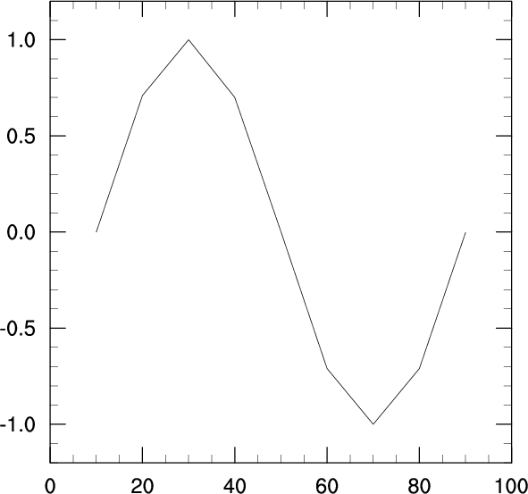
x = [10., 20.00, 30., 40.0, 50.000, 60.00, 70., 80.00, 90.000]
Specify the x values to use for the XY plot. Any argument to an Ngl function that is a 1-dimensional array can be specified as a Python list, a Python tuple, or a rank 1 NumPy array.
y = [ 0., 0.71, 1., 0.7, 0.002, -0.71, -1., -0.71, -0.003]
Specify the x values to use for the XY plot. Any argument to an Ngl function that is a 1-dimensional array can be specified as a Python list, a Python tuple, or a rank 1 NumPy array.
  wks_type = "ps"
  wks = Ngl.open_wks(wks_type,"ngl01p")  # Open a workstation.
To produce graphics with PyNGL, you need to tell it where to draw the graphics. The choices, which are also known as workstations, are an X11 window, an NCAR Graphics metafile (NCGM), a PostScript file (regular, encapsulated, or encapsulated interchange), and a PDF (Portable Document Format) file.
The function Ngl.open_wks opens one of these types of workstations so you can draw graphics to it. The first argument (a string) indicates where you want the graphical output drawn ("x11" for an X11 window; "ncgm" for an NCGM; "ps", "eps", or "epsi" for a PostScript file; and "pdf" for a PDF file). The second argument (also a string) determines the name of the file if you draw the graphical output to an NCGM, PostScript, or PDF file (name.ncgm for an NCGM file, name.{ps,eps,epsi} for a PostScript file, and name.pdf for a PDF file, where name is the second string you pass in). The second argument also comes into play when resource files are discussed in example 8 and 9.
There is an optional third argument and, if present, references a resource list (these will be discussed below). If the argument is omitted, as above (or specified as None), then it defaults to None, indicating that no resource list is to be used in this call.
The value returned from Ngl.open_wks is used in subsequent calls to reference the selected output workstation.
plot = Ngl.xy(wks,x,y) # Draw an XY plot.
The function Ngl.xy creates and draws an XY plot and returns a variable reference to the plot (in most cases you will not need to use this return value). The first argument is the workstation you want to draw the XY plot to (the variable returned from the previous call to Ngl.open_wks). The next two arguments are the variables containing the X and Y arrays that you want to plot. In the case of 1-dimensional arrays, as we have here, the arguments can be Python lists or tuples of numeric values, or NumPy arrays. In the case of higher dimension arrays, the arguments must be NumPy arrays (as illustrated in the next plot in this example). There is an optional fourth argument and, if present, references a resource list (these will be discussed below). If the argument is omitted as above (or specified as None), then it defaults to None, indicating that no resource list is to be used in this call.
The Ngl.xy function draws the XY plot with tick marks selected at "nice" values. No title or X/Y axis labels are provided in the default plot, but these can be easily added as shown in the next few plots. You can also change the style of the tick marks as shown in example 7.
By default, when a plot is drawn to an X11 window or an NCGM file, it has a black background and a white foreground. If a plot is drawn to a PostScript or PDF file, it has a white background and a black foreground. In later examples, you will learn how to specify the background and foreground colors, and when you do this, the plot has the same colors, no matter which workstation you draw it to.
Since you opened a workstation type of "x11", the Ngl.xy function produces an X11 window on which you need to click with the left mouse button to advance to the next frame.
#----------- Begin second plot -----------------------------------------
Divider in the code to indicate the start of the code for the second plot.
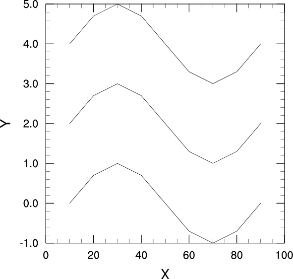
Draw an XY plot with three curves, each curve having nine points.
  y2 = numpy.array([[0., 0.7, 1., 0.7, 0., -0.7, -1., -0.7, 0.],  \
                    [2., 2.7, 3., 2.7, 2.,  1.3,  1.,  1.3, 2.],  \
                    [4., 4.7, 5., 4.7, 4.,  3.3,  3.,  3.3, 4.]], \
                    'f')
Define a 3 x 9 array (the first dimension represents the number of curves, and the second dimension represents the number of points). Note that this time you are not using a Python list or tuple to set the array, because in PyNGL arrays of higher dimension than one have to be NumPy arrays. PyNGL is able to determine the dimensionality and type of a variable from the NumPy array.
resources = Ngl.Resources()
This line introduces the concept of using "resources" to change the look of a plot. In PyNGL, there are hundreds of resources you can set for changing line colors and thicknesses, adding titles, changing fonts, creating label bars and legends, changing map projections, modifying the size of a plot, masking out certain areas, etc. There are also resources for changing the data of a plot, like setting minimum and maximum values, selecting strides or subsets of data, and setting missing values.
Most resources have default values that are either hard-coded or set dynamically by PyNGL when you run the PyNGL script. For example, the line thickness for a curve is hard-coded to a value of 1.0, but the minimum and maximum values of a curve are set dynamically according to the actual minimum and maximum data values used in the XY plot. You only need to set a resource if you want to change its default value.
Resources are grouped by the type of graphical object or data they describe, and these groupings are discussed here and in other examples.
To set resources for use by the Ngl functions, first define an instantion of a the resource class, then specify the resources as attributes of this object. This object can have an unlimited number of attributes. The object that you create should then get passed to the appropriate plotting routine for the resources to take effect.
  resources.tiXAxisString = "X"
  resources.tiYAxisString = "Y"
Set some resources for changing the labels of the X and Y axes. Title resources belong to the "Title" group and start with "ti."
plot = Ngl.xy(wks,x,y2,resources) # Draw the plot.
Draw a new XY plot, using the same X array from the first plot and the new y2 array you just defined. Since x is only a 1-dimensional array, PyNGL pairs the values in the x array with the values in each of the three curves in the y2 array. If a 3 x 9 X array had been declared in addition to the 3 x 9 Y array, then each value in the Y array would have been paired with the corresponding value in the X array.
Note the new X and Y axis labels that result from the attributes tiXAxisString and tiYAxisString being set for each axis.
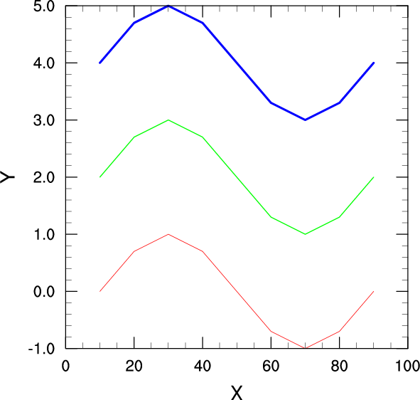
#----------- Begin third plot -----------------------------------------
Draw the same three curves, using different colors and line thicknesses for each one.
resources.xyLineColors = [189,107,24] # Define line colors.
Set the resource xyLineColors to define a different line color for each line. The default is 1 which is the foreground color ("white" in this case). The colors specified here are represented by integer index values, where each index maps to a color in a predefined color table (also called a "color map"). Since a color table has not been defined in this example, a rainbow color table with 190 indices is provided by PyNGL (later examples will show how to create your own color map). In the default color table, the integer values 189, 107, and 24 represent the colors "red", "green", and "blue" respectively.
Color resources can also be set using named colors, so the xyLineColors resource could have been set with the following code:
resources.xyLineColors = ["red","green","blue"]Named colors are covered in more detail in examples 4 and 7.
If you had wanted the same line color for each curve, but wanted it something other than "1", then you could have used the singular resource, xyLineColor.
XY plot resources belong to the "XyPlot" group and start with the letters "xy". Each resource is documented with its type and its default value in the XyPlot resource descriptions section.
resources.xyLineThicknesses = [1.,2.,5.] # Define line thicknesses
Using the xyLineThicknesses resource, define a different line thickness for each curve. The default thickness is 1.0, so a value of 2.0 doubles the line thickness and a value of 5.0 increases the line thickness by a factor of 5, and so on. Again, you could have used the singular resource xyLineThicknessF to set all the curves to the same thickness.
plot = Ngl.xy(wks,x,y2,resources)
Draw the plot, this time passing the list of resources that you just created. Each curve is a different color and has a different line thickness.
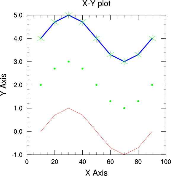
#---------- Begin fourth plot ------------------------------------------
Create the same plot as before, only add a title at the top, change the X and Y axis labels, change the font of the title and labels, and use markers and/or lines to draw each curve.
Since you are creating the same plot as before, you want to keep the same resources that you set for the previous XY plot. You can just add more attributes to the resources to customize the plot some more.
If you had wanted to go back to all the default resources before creating the next XY plot, you could have either used a new object for the resources, or deleted the current list of resources with the del resources command and started over with a new list.
  resources.tiMainString    = "X-Y plot"  # Title for the XY plot
  resources.tiXAxisString   = "X Axis"    # Label for the X axis
  resources.tiYAxisString   = "Y Axis"    # Label for the Y axis
Set some resources for adding a title to the top of the plot and for changing the labels of the X and Y axes. Title resources belong to the "Title" group and start with "ti." They are documented in the Title resource descriptions section of the NCL Reference Manual.
  resources.tiMainFont      = "Helvetica" # Font for title
  resources.tiXAxisFont     = "Helvetica" # Font for X axis label
  resources.tiYAxisFont     = "Helvetica" # Font for Y axis label
Set some resources for changing the font of the titles you just defined above. Fonts can be set by using a string that describes the font, or by using an index into a font table. Visit the font tables to see the available fonts along with their names and index values. Note that predefined strings, like those listed in the font table, are case-insensitive, and that you could have specified the font with "helvetica" or "HELVETICA" or any another combination of upper case and lower case characters.
  resources.xyMarkLineModes = ["Lines","Markers","MarkLines"]
  resources.xyMarkers       = [0,1,3]     # (none, dot, asterisk)
Use the xyMarkLineModes resource to add markers to the curves (since the default is to draw all curves without markers). There are three types of lines that can be drawn: regular lines ("Lines"), markers only ("Markers"), and lines with markers ("MarkLines"). In this plot, you are using this resource to invoke all three kinds of lines. The xyMarkers resource defines the type of markers you want to use. There are Markersseventeen marker styles to choose from.
  resources.xyMarkerColor   = 107         # Marker color
  resources.xyMarkerSizeF   = 0.03        # Marker size (default
By using the "singular" resources xyMarkerColor and xyMarkerSizeF instead of the "plural" resources xyMarkerColors and xyMarkerSizes, you get the same marker color and size for all the lines that have markers. The default marker size is 0.01, so a value of 0.03 triples the marker size.
plot = Ngl.xy(wks,x,y2,resources) # Draw an XY plot.
Draw the plot with the new resources you set.
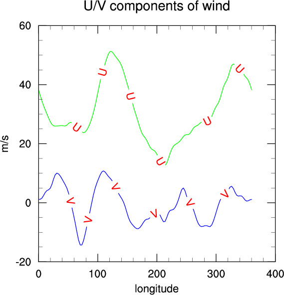
#---------- Begin fifth plot ------------------------------------------
Read in some data from an ASCII file, set several resources for titles, line colors, and labeling lines, and then create an XY plot with two curves.
filename = Ngl.pynglpath("data") + "/asc/xy.asc"
The built-in function Ngl.pynglpath returns the full pathname for a given PyNGL system directory, or the default value for a particular internal parameter.
data = Ngl.asciiread(filename,(129,4),"float")
The built-in function Ngl.asciiread can be used to read data from an ASCII file and return a NumPy array of the specified shape. The type argument can be "float", "integer", or "double". Numbers are read from the specified file until the array is filled.
  uv = numpy.zeros((2,129),'f')
  uv[0,:] = data[:,1]
  uv[1,:] = data[:,2]
Create a 2-dimensional float array dimensioned 2 x 129 and assign some values of data to it.
  lon     = data[:,0]
  lon     = (lon-1) * 360./128.
Assign data's first set of 129 values to the variable lon. Since the values stored in the lon variable range from 1.0 to 129.0, and are actually supposed to represent longitude values from 0.0 to 360.0 in steps of 360/128, you need to convert each value by subtracting 1 and multiplying it by 360/128. Since data is a NumPy array you can do scalar arithmetic on a whole array using the same notation as if it were a scalar value. You can also multiply, divide, add, and subtract arrays in one step as long as they are the appropriate size for doing such array computations.
  del resources            # Start with new list of resources.
  resources = Ngl.Resources()
Assuming you don't want to use any of the resources that had been set for the earlier plots, you can start with a new template of resources using the del command. If you plan to set some new resources, you must instantiate the resources object again. You could have also just used a new resource object name.
  resources.tiMainString           = "U/V components of wind"
  resources.tiXAxisString          = "longitude"
  resources.tiYAxisString          = "m/s"
  resources.tiXAxisFontHeightF     = 0.02        # Change the font size.
  resources.tiYAxisFontHeightF     = 0.02
Set some resources for putting a title on the plot, labeling the X and Y axes, and changing the font size of the X/Y axis labels.
  resources.xyLineColors           = [107,24]    # Set the line colors.
  resources.xyLineThicknessF       = 2.0         # Double the width.

  resources.xyLabelMode            = "Custom"    # Label XY curves.
  resources.xyExplicitLabels       = ["U","V"]   # Labels for curves
  resources.xyLineLabelFontHeightF = 0.02        # Font size and color
  resources.xyLineLabelFontColor   = 2           # for line labels
Set some resources for defining line colors and thicknesses and for creating line labels. You set xyLabelMode to "Custom" to indicate that you want to customize how to label the XY plot curves (there are no labels by default). You can indicate what labels you want with the xyExplicitLabels resource. The xyLineLabel* resources used here change the font size and color of the line labels.
plot = Ngl.xy(wks,lon,uv,resources) # Draw an XY plot with 2 curves.
Draw an XY plot, using the new list of resources you just set.
  del plot
  del resources
Use the del command to remove some of the objects created in this script. This is not really necessary in this case, since you are at the end of the script, but it's a good idea to get in the habit of cleaning up objects that you no longer need.
Ngl.end()
Every PyNGL script must end with a Ngl.end(). This is necessary in order to flush buffers. If you get an error in processing an output NCGM, PS, or PDF file, it is likely because you failed to put in a Ngl.end.