
PyNGL > tutorial examples > 1 | 2 | 3 | 4 | 5 | 6 | 7 | 8 | 9 | 10 | 11
Example 10 - publication-quality XY plot
This example creates an XY plot and shows how to draw text strings on it using calls to Ngl.text. It also shows how to use various text function codes to create subscripts, line feeds, and change the default font.This example produces a publication-quality plot.
There are two ways to run this example:
execute
pynglex ngl10p
or
download
ngl10p.pyand then type:
python ngl10p.py
Output from example 10
| Frame 1 |
|---|
|
(Click on the frame to see it enlarged.)
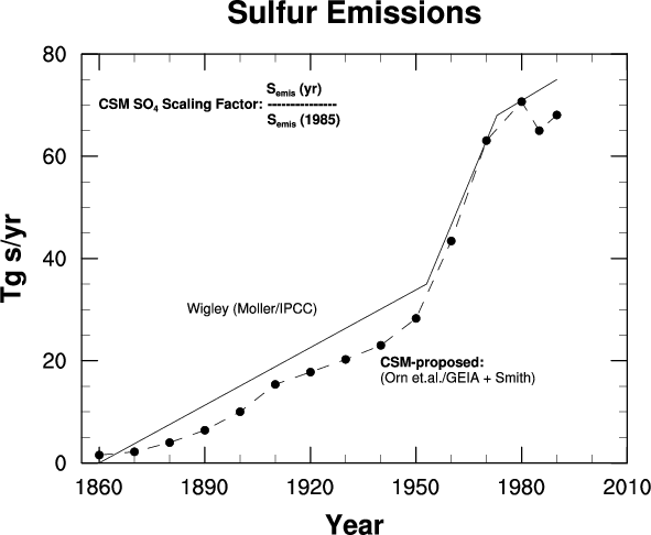
  0. #
  1. #  Import NumPy.
  2. #
  3. import numpy
  4.
  5. #
  6. #  Import PyNGL support functions.
  7. #
  8. import Ngl
  9.
 10. #
 11. #  The function "wigley" performs computations on the input array
 12. #  based on where the values are less than 1953, are between
 13. #  1953 and 1973 inclusive, or greater than 1973.
 14. #
 15. def wigley(time):
 16.   y = numpy.zeros(time.shape).astype(type(time))
 17.   numpy.putmask(y,numpy.less(time,1953.),         \
 18.                 ((time-1860.)/(1953.-1860.)) * 35.0)
 19.   numpy.putmask(y,numpy.logical_and(numpy.greater_equal(time,1953.),  \
 20.                                     numpy.less_equal(time,1973.)),    \
 21.                 ((time-1953.)/(1973.-1953.)) * (68. - 35.) + 35.)
 22.   numpy.putmask(y,numpy.logical_and(numpy.greater(time,1973.),        \
 23.                                     numpy.less_equal(time,1990.)),    \
 24.                 ((time-1973.)/(1990.-1973.)) * (75. - 68.) + 68.)
 25.   return y
 26.
 27. #
 28. #  Main program.
 29. #
 30. time1 = numpy.array([1990,  1985,  1980,  1970,  1960,  1950,  1940,  1930, \
 31.                      1920,  1910,  1900,  1890,  1880,  1870,  1860],
 32.                      'i')
 33. y1    = numpy.array([68.065, 65.00, 70.67, 63.06, 43.42, 28.28, 23.00,  \
 34.                      20.250, 17.77, 15.36, 10.01,  6.40,  3.98,  2.18,  \
 35.                       1.540], 'f')
 36.
 37. time2 = numpy.arange(min(time1),max(time1)+1,1)
 38.
 39. y2 = wigley(time2)      # Calculate proposed values as a function of time.
 40.
 41. maxdim = max(y1.shape[0],y2.shape[0])
 42. y    = -999.*numpy.ones((2,maxdim),'f')  # Create 2D arrays to
 43. time = -999.*numpy.ones((2,maxdim),'f')  # hold 1D arrays above.
 44.
 45. y[0,0:y1.shape[0]] = y1
 46. y[1,0:y2.shape[0]] = y2
 47.
 48. time[0,0:time1.shape[0]] = time1.astype('f')
 49. time[1,0:time2.shape[0]] = time2.astype('f')
 50.
 51. #
 52. #  Define a color map and open a workstation.
 53. #
 54. cmap = numpy.zeros((2,3),'f')
 55. cmap[0] = [1.,1.,1.]
 56. cmap[1] = [0.,0.,0.]
 57. rlist = Ngl.Resources()
 58. rlist.wkColorMap = cmap
 59. wks_type = "ps"
 60. wks = Ngl.open_wks(wks_type,"ngl10p",rlist)
 61.
 62. resources = Ngl.Resources()
 63.
 64. resources.caXMissingV = -999.
 65. resources.caYMissingV = -999.
 66.
 67. resources.vpWidthF     = 0.8
 68. resources.vpXF         = 0.13
 69.
 70. resources.tiMainString  = "~F22~Sulfur Emissions" # "~F22~" changes
 71. resources.tiXAxisString = "~F22~Year"             # the font to "22"
 72. resources.tiYAxisString = "~F22~Tg s/yr"          # which is helvetica
 73.                                                     # bold.
 74. resources.tmXBLabelFont = "helvetica"
 75. resources.tmYLLabelFont = "helvetica"
 76.
 77. resources.trXMinF              = 1855 # Set minimum X axes value.
 78.
 79. resources.xyDashPatterns       = [16,0]   # ( dash, solid )
 80. resources.xyMarkLineModes      = ["MarkLines","Lines"]
 81. resources.xyMarker             = 1
 82. resources.xyMarkerSizeF        = 0.05 # Default is 0.01
 83.
 84. resources.nglFrame             = False # Don't advance the frame.
 85.
 86. xy = Ngl.xy(wks,time,y,resources)  # Create and draw XY plot.
 87.
 88. txresources               = Ngl.Resources()
 89. txresources.txFontHeightF = 0.015
 90. txresources.txJust        = "CenterLeft" # Default is "CenterCenter".
 91. txresources.txFuncCode    = "~"          # Default is "~"
 92.
 93. strings = ["Wigley (Moller/IPCC)",\
 94.        "~F22~CSM-proposed:~F~~C~(Orn et.al./GEIA + Smith)",\
 95.        "~F22~CSM SO~B~4~N~ Scaling Factor: ~V1Q~~F22~S~B~emis~N~ (yr)~H-7Q~~V-1Q~---------------~H-9Q~~V-1Q~S~B~emis~N~ (1985)"]
 96.
 97. xpos = [1885.,1940.,1860.]   # Define X/Y locations for text.
 98. ypos = [30.,18.,70.]
 99.
100. #
101. #  Loop through text strings and plot them.
102. #
103. for i in xrange(0,len(strings)):
104.   Ngl.text(wks,xy,strings[i],xpos[i],ypos[i],txresources)
105.
106. Ngl.frame(wks)
107.
108. Ngl.end()
Explanation of example 10
Line 15:
def wigley(time):
Define a Python function called wigley to calculate some values as a function of time. These calculated values are returned in a NumPy float array of the same shape as the input variable time.
  time1 = numpy.array([1990,  1985,  1980,  1970,  1960,  1950,  1940,  1930, \
                       1920,  1910,  1900,  1890,  1880,  1870,  1860],
                       'i')
  y1    = numpy.array([68.065, 65.00, 70.67, 63.06, 43.42, 28.28, 23.00,  \
                       20.250, 17.77, 15.36, 10.01,  6.40,  3.98,  2.18,  \
                        1.540], 'f')
Define some data for the XY plot. These data are from a number of sources and were compiled to show the total global annual emissions of sulfur.
time2 = numpy.arange(min(time1),max(time1)+1,1)
Set time2 to an array of time values spanning time1 in unit increments.
y2 = wigley(time2) # Calculate proposed values as a function of time.
Interpolate the data using the wigley function defined above.
  maxdim = max(y1.shape[0],y2.shape[0])
  y    = -999.*numpy.ones((2,maxdim),'f')  # Create 2D arrays to
  time = -999.*numpy.ones((2,maxdim),'f')  # hold 1D arrays above.

  y[0,0:y1.shape[0]] = y1
  y[1,0:y2.shape[0]] = y2

  time[0,0:time1.shape[0]] = time1.astype('f')
  time[1,0:time2.shape[0]] = time2.astype('f')
To create an XY plot that draws the actual data values (y1) and the interpolated data values (y2) as two separate curves, define a 2-dimensional array y to hold the values for both of these curves, where the first dimension is the number of curves (2) and the second dimension is the number of points. The two curves might not have the same number of points, so the second dimension of y is set to the maximum of the dimensions of y1 and y2.
Multiplying by -999.0 in the initial array creations sets that as the initial value for all array elements. This will be specified as the coordinate array missing value for the curves so that Ngl.xy does not plot any such values.
  cmap = numpy.zeros((2,3),'f')
  cmap[0] = [1.,1.,1.]
  cmap[1] = [0.,0.,0.]
  rlist = Ngl.Resources()
  rlist.wkColorMap = cmap
  wks_type = "ps"
  wks = Ngl.open_wks(wks_type,"ngl10p",rlist)
Define a color map with a black foreground and a white background and open a workstation. Details on defining color maps are given in example 2.
  resources.caXMissingV = -999.
  resources.caYMissingV = -999.
Specify the coordinate array missing values for X and Y.
resources.trXMinF = 1855 # Set minimum X axes value.
Change the minimum value of the left bound of the X axis (the actual minimum of the X axis is 1860). This is to provide extra space around the curves.
  resources.xyDashPatterns       = [16,0]   # ( dash, solid )
  resources.xyMarkLineModes      = ["MarkLines","Lines"]
  resources.xyMarker             = 1
  resources.xyMarkerSizeF        = 0.05 # Default is 0.01
Set some resources so that the actual data values are drawn with a dashed line and round markers and the interpolated values are drawn with a solid line. The marker size is increased by a factor of 5, since the default size is 0.01.
resources.nglFrame = False # Don't advance the frame.
Since you are drawing text strings on the XY plot with separate calls to Ngl.text, you don't want the frame to be advanced yet.
xy = Ngl.xy(wks,time,y,resources) # Create and draw XY plot.
Call Ngl.xy to draw the XY plot with the two curves.
txresources.txJust = "CenterLeft" # Default is "CenterCenter".
Change the resource that determines how strings are centered with respect to the X/Y position they are drawn at. By setting the txJust resource to "CenterLeft", strings are centered vertically about the Y coordinate location, and flush left horizontally with respect to the X coordinate location. The default of txJust is "CenterCenter".
txresources.txFuncCode = "~" # Default is "~"
As noted in example 5, PyNGL allows text function codes to be embedded in strings to get sub/superscripting, different fonts, carriage returns, etc. By default, each function code is preceded and succeeded with a colon, so use the txFuncCode resource to set the function code to something other than a colon. This is only necessary if you want to use a colon as part of one or more of the text strings. In this case, you are changing the function code to "~".
  strings = ["Wigley (Moller/IPCC)",\
         "~F22~CSM-proposed:~F~~C~(Orn et.al./GEIA + Smith)",\
         "~F22~CSM SO~B~4~N~ Scaling Factor: ~V1Q~~F22~S~B~emis~N~ (yr)~H-7Q~~V-1Q~---------------~H-9Q~~V-1Q~S~B~emis~N~ (1985)"]
Define three strings to draw on the plot. You are using text function codes to change the font to Helvetica-bold ("~F22~"), to change the vertical and horizontal spacing ("~V1Q~", "~V-1Q~", "~H-7Q~", and "~H-9Q~"), to add a carriage return ("~C~"), and to do subscripting ("~B~"). The function codes "~F~" and "~N~" are used to return to the default font and to get out of subscript mode.
  xpos = [1885.,1940.,1860.]   # Define X/Y locations for text.
  ypos = [30.,18.,70.]
Create two arrays to define the X and Y positions of each of the three text string you created above. The X and Y positions are specified in the same data space as the curves in the XY plot you created.
  for i in xrange(0,len(strings)):
    Ngl.text(wks,xy,strings[i],xpos[i],ypos[i],txresources)
Loop through the list of text strings you created and draw each one using Ngl.text.