
Hints to PyNGL/PyNIO exercises
- Basic graphics exercise hints
- Color exercise hints
- Title exercise hints
- XY plot exercise hints (set 1)
- XY plot exercise hints (set 2)
- Contour plot exercise hints
- Contours over maps exercise hints (set 1)
- Contours over maps exercise hints (set 2)
- Vector plot exercise hints
- Primitives exercise hints (set 1)
- Primitives exercise hints (set 2)
- Primitives exercise hints (set 3)
- Paneling exercise hints
Basic graphics exercise hints
- To have the script generate a PS or PDF
file, change "x11" to "ps" or "pdf" in the call to Ngl.open_wks. Change the second argument to
indicate the name of the PS or PDF file to write to.
[Answer script] [Image]
- To rotate the image for PS or PDF output,
you need to use the resource wkOrientation. Read the documentation
on Ngl.open_wks for information on
how to set this resource.
Setting a resource requires creating a resource list using call to "Ngl.Resources()".
[Answer script] [Image]
- nglMaximize
is True by default, which forces the plot to be maximized in the
output device you're using. This means if you are drawing to a PS file
that will be sent to an 8-1/2 x 11 piece of paper, the plot may be
rotated to landscape mode if the plot is wider than it is high (which
should be the case here). If you don't want the plot maximized in the
frame, set this resource to False.
[Answer script] [Image]
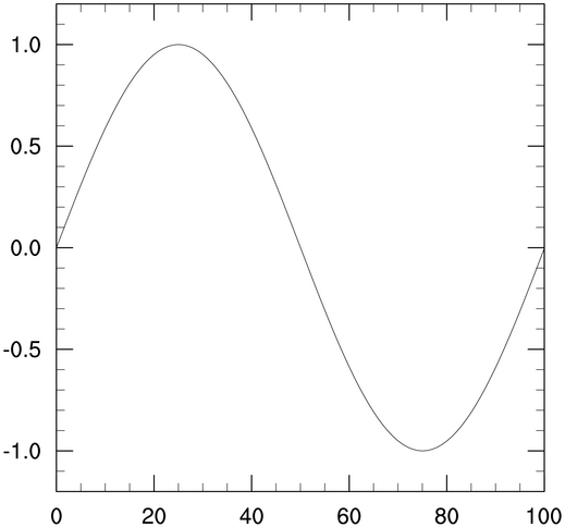
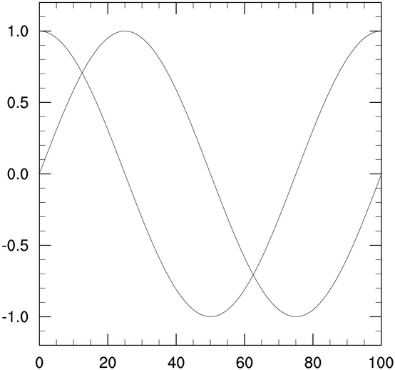
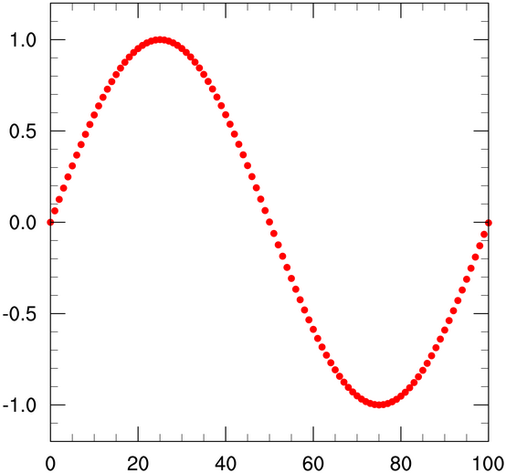
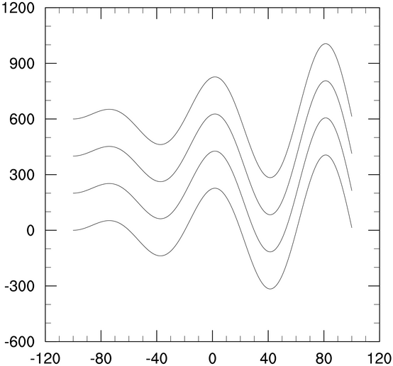
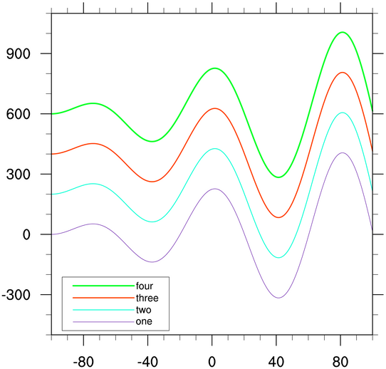
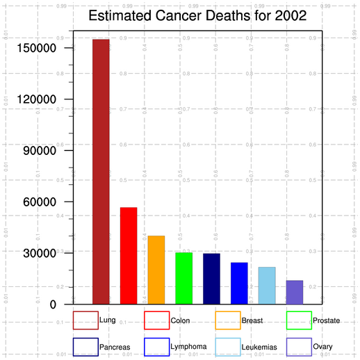
- Drawing another plot is simple. Just
add another call to Ngl.y,
and pass it the new set of y points.
Note that if your output is going to an X11 window, you will need to click on the X11 window with your left mouse button to advance the frame to the second picture, and then again to close the window.
If your output is going to a PS or PDF file, each plot will appear on a separate page.
[Answer script] [Image 1] [Image 2]
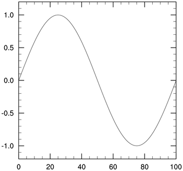
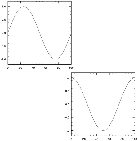
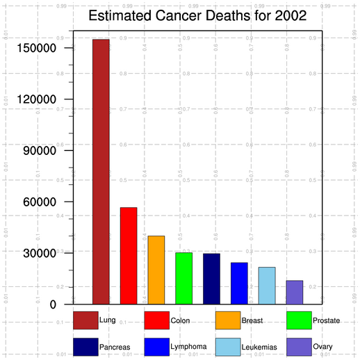
- Setting nglFrame to False causes the frame not to be
advanced, and hence if you draw a second plot, it will be drawn on the
same frame (or page), as the previous plot.
To set nglFrame to False for one plot and not the other, set it to False before the first call, and then back to True for the second call. Or, you can just delete it before you generate the second plot.
If your output is going to an X11 window, you will only see one X11 window pop up, and the second plot will be drawn to the same window.
If your output is going to a PS or PDF file, both plots will be draw on the same page.
[Answer script] [Image]
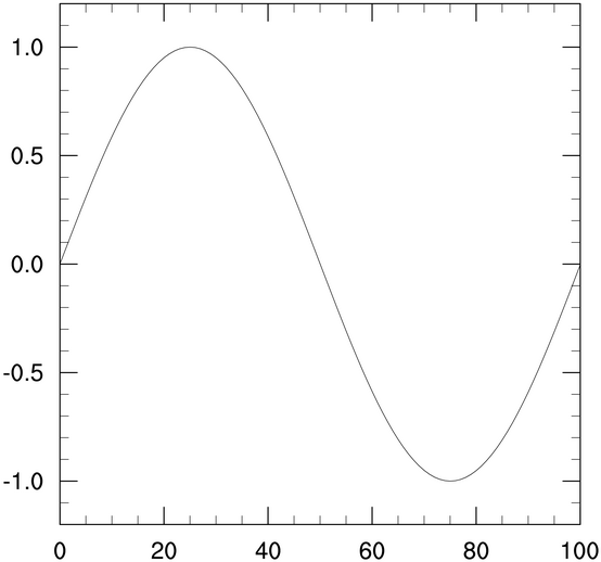
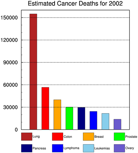
- Use the viewport vpXF, vpYF,
vpWidthF, and vpHeightF, to reposition and resize individual
plots. The values of the vpXF and
vpYF resources represent the top left
corner of the plot.
To advance the frame manually, call the Ngl.frame procedure. You must advance the frame after you are done drawing to it, because otherwise the output graphics file(s) will not be closed properly.
Note that when you use "vp" resources to position plot(s) on a page, the nglMaximize resource will no longer have effect.
[Answer script] [Image]
Note: if your plots are the exact same size, and you want to panel them on a page, then use Ngl.panel to do this.
Color exercise hints
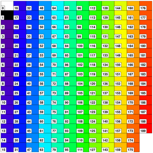
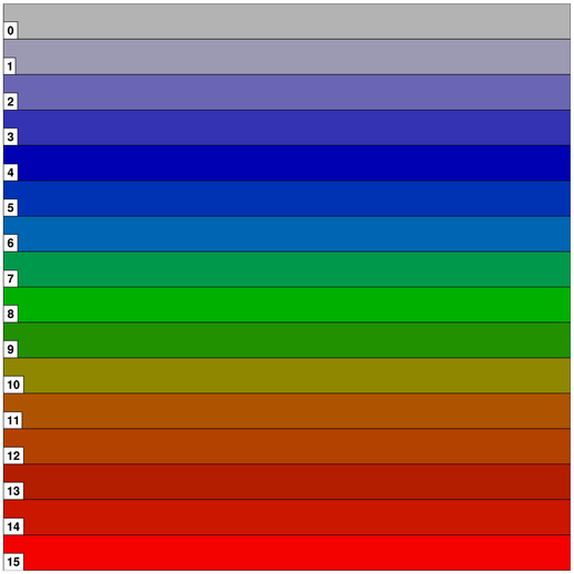
- Use the procedure Ngl.draw_colormap to draw the current
color table. Each color will have its corresponding index included.
Color index 0 represents the background color, and 1 represents
the foreground color.
[Answer script] [Image]
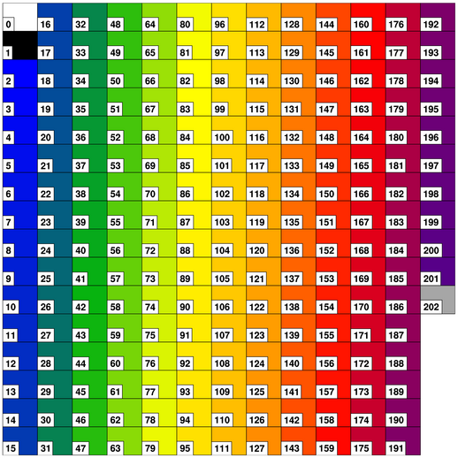
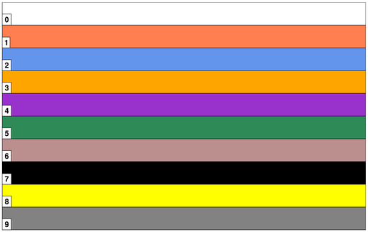
- Use the procedure Ngl.define_colormap to change the color
table (also known as a "color map"). It is generally a good idea to
have only one color table per frame (page).
[Answer script] [Image]
- Use the function Ngl.new_color to add a new color to a color
table. The existing color table must have less than 256 colors, as
this is the maximum number of colors you can have. The color will be
added to the end of your color table.
The color gray is represented by RGB triplets that have the same values, like (0.1,0.1,0.1) or (0.85,0.85,0.85). The larger the values, the lighter the shade of gray.
[Answer script] [Image]
- Use the procedure Ngl.define_colormap to create a
new color table using RGB triplets. Since you need to
create an n x 3 array, use NumPy's "array"
function to create it.
[Answer script] [Image]
There are other ways to create your own color table. For more information, see the short write up on creating your own color table.
- Use the procedure Ngl.define_colormap to create a
new color table using named colors.
To see all the color names and their corresponding colors, see the named colors gallery.
[Answer script] [Image]
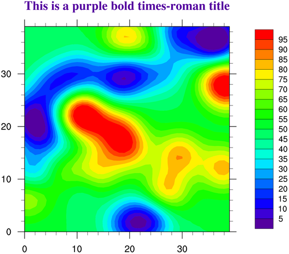
Title exercise hints
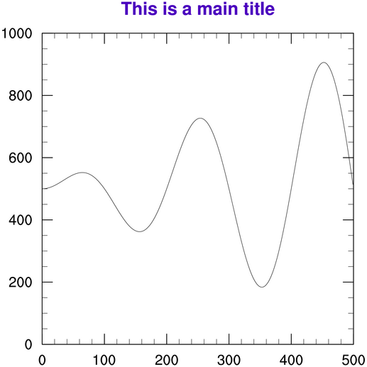
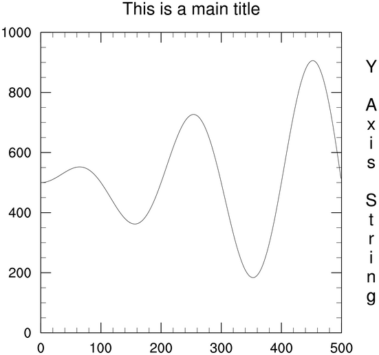
- Resources for changing attributes of the
main title start with "tiMain" and are listed alphabetically in the
title
resource page.
[Answer script] [Image]
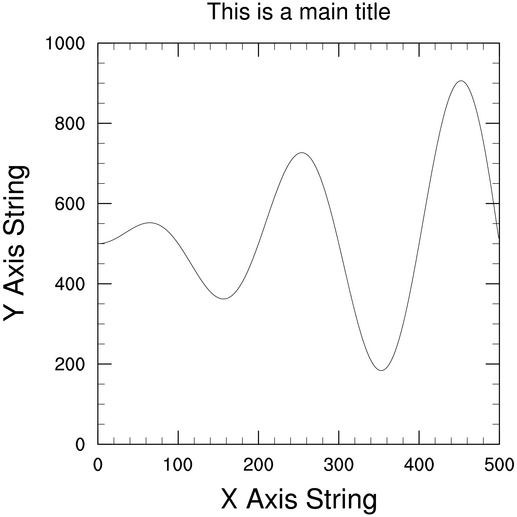
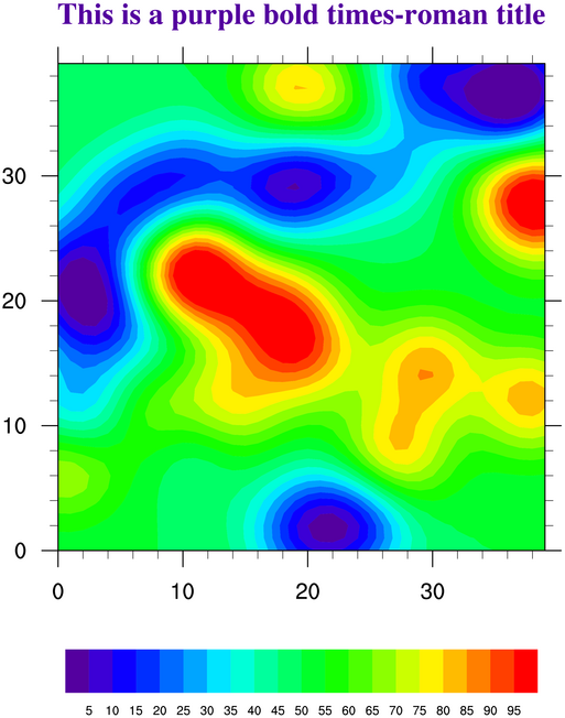
- Resources for changing attributes of the
X or Y axis titles start with "tiXAxis" and "tiYAxis". The resources
for the main title, X axis title, and Y axis title have the same
structure, i.e. "tiMainFont", "tiXAxisFont", and "tiYAxisFont".
This makes it easier to remember resource names.
[Answer script] [Image]
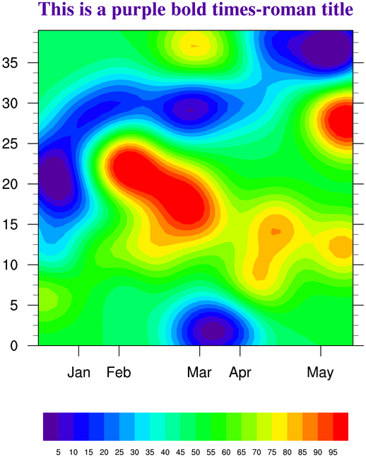
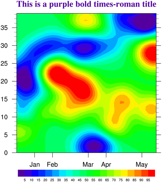
- If you change the orientation of text,
this may also change the direction of the text. This means you need to
set two resources in order to change the orientation of the Y axis
title. You unfortunately can't have a title on both Y axes using the
"ti" resources. You would need to use Ngl.add_text if you wanted to add an
additional title to one of the axes.
[Answer script] [Image]
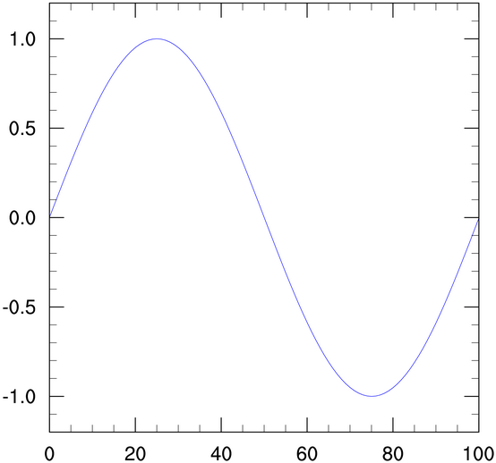
XY plot exercise hints (set 1)
- Resources for changing attributes of an XY
line start with "xyLine" and are listed alphabetically in the XY resource
page.
[Answer script] [Image]
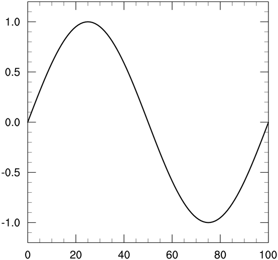
- All line thickness resources have names like
xyLineThicknessF, xyLineThicknesses, cnLineThicknessF, cnLineThicknesses, gsLineThicknessF, etc. The default is
usually 1.0, so a value of 2.0 makes the line twice as
thick. Sometimes you need to make lines thicker so they'll look better
in a PS or PDF file.
[Answer script] [Image]
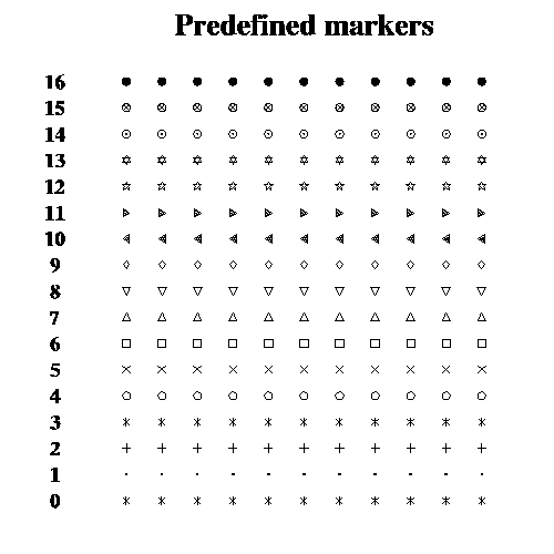
- Changing an XY plot so that markers are used
instead of lines involves changing a "mode" resource. To then change
the look of a marker, there are a series of "xyMarker" resources you
can set. You can see a list of predefined markers in the marker table.
[Answer script] [Image]
Try playing with these and other xyMarker resources to change the marker, color, size, etc.
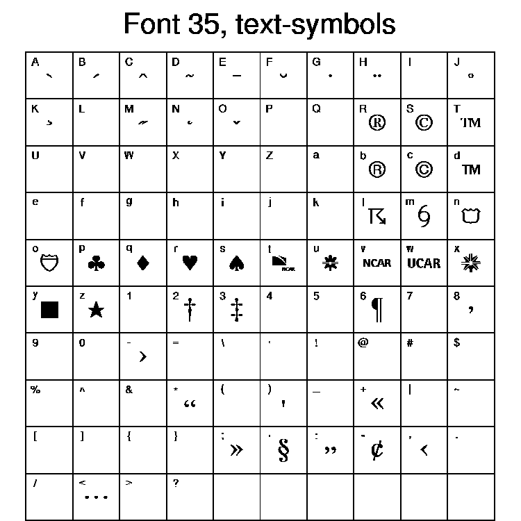
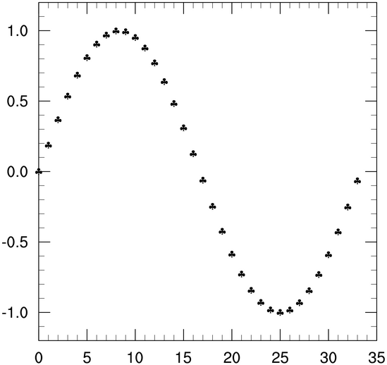
- If you don't like any of the predefined markers, you can define your
own using Ngl.new_marker. This
function allows you to use any of the characters in any of the font tables as a marker. In the
script below, the character "p" is used from font table 35.
If you don't want to plot every value, you can use the "::" syntax to subscript your data array. Using "::2" will grab every other point, while, "::3" will grab every third point.
[Answer script] [Image]
Try playing with these and other xyMarker resources to change the marker, color, size, etc.
XY plot exercise hints (set 2)
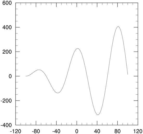
- Use Ngl.fspan to generate the X array. In order
to use it in a call to Ngl.xy, it
must be the same length as its corresponding Y array.
[Answer script] [Image]
- You can reorder the dimensions by using the
NumPy function "transpose". If you try to plot the array without
transposing it, PyNGL will try to plot 500 curves each with 4 points,
and you will get lots of error messages about too many legends
being created.
[Answer script] [Image]
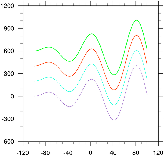
- Some resources have both scalar and plural
representations, like xyLineColor and
xyLineColors. If you use a scalar resource
for a multi-curve plot, the value will apply to all curves.
[Answer script] [Image]
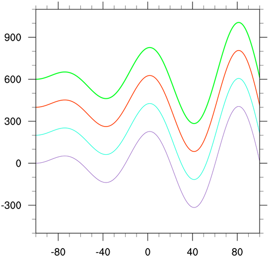
- Changing the area that the data is
displayed in involves a transformation of the data to a new space, so
you need to use Transformation
resources to change the axes limits.
[Answer script] [Image]
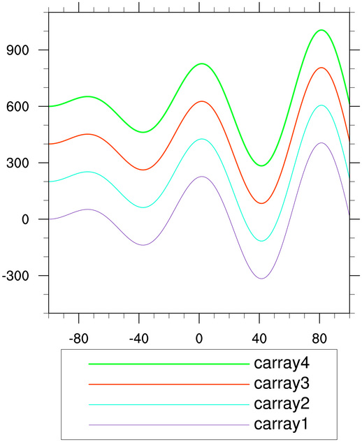
- When you create an XY plot, an automatic
legend is created for you, although it is not drawn by default. To
force the draw of the legend, set a PlotManager
resource called pmLegendDisplayMode. The PlotManager is
something that manages additional annotations of a plot, like
labelbars, titles, and legends.
[Answer script] [Image]
- Legends are somewhat confusing in PyNGL.
To change various aspects of a legend, you may need to use xy,
pm, and
lg
resources. For this particular exercise, no "lg" resources are
involved.
[Answer script] [Image]
Contour plot exercise hints
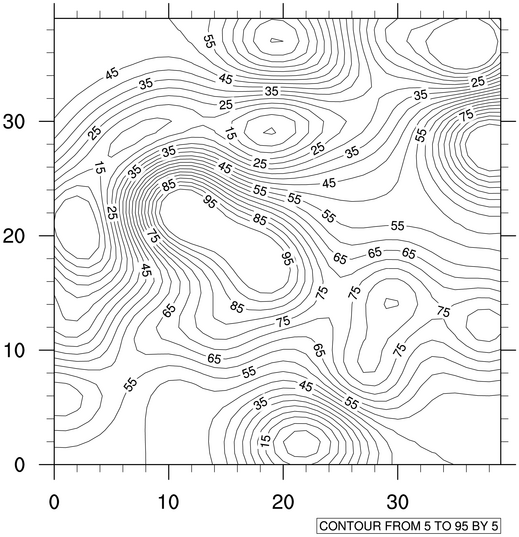
- There are three ways you can set
contour levels: 1) let PyNGL do it automatically, 2) set a minimum
level, maximum level, and a level spacing, or 3) set an array of
contour levels.
The default behavior is #1. To do #2 or #3, you need to set the cnLevelSelectionMode resource to the "mode" you want, and then set the other resources depending on the mode you choose.
[Answer script] [Image]
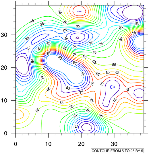
- Whenever you have a single and plural
version of a resource, like "cnLineColor" and "cnLineColors", there's usually a
corresponding "Mono" resource ("cnMonoLineColor") that takes a logical
True/False value. This allows you to specify whether to use the
singular or plural version of the resource to apply to that specific
plot feature.
You need to know whether the corresponding Mono resource's default is True or False to know whether you need to change it.
Other contour line resources start with "cnLine".
[Answer script] [Image]
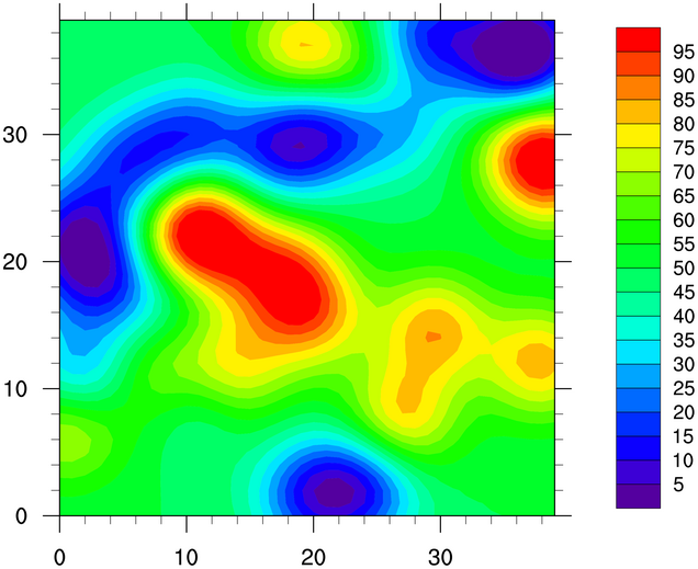
- Use contour
resources ending in "On" to toggle certain plot features on
and off.
In PyNGL, the contour fill colors are selected such that they span the full color map (nglSpreadColors=True). [Note: if you only want a particular part of your color map spanned, you can set the resources nglSpreadColorStart and nglSpreadColorEnd to the desired start and end indexes.]
[Answer script] [Image]
- Use the "ti"
resources to add and change titles. You can use a function code to change the
font.
[Answer script] [Image]
- A labelbar is added automatically when
contour fill is set. By default, it is vertical; use a
labelbar resource to change the orientation to horizontal. [Answer script] [Image]
- Tickmark resources can be set for XY, vector, streamline, and contour plots, and hence they have their own set of resources that start with the letters "tm".
There are three ways you can change the labels on a tickmark axis: 1) let PyNGL do it automatically, 2) set a minimum and maximum tickmark value and a tickmark spacing, or 3) set arrays of tickmark values and labels you want at those values. For this exercise, you will use #2 for the Y axis, and #3 for the X axis.
Each of the four axes has its own set of tickmark resources. By default, however, the right/left axes will use the same resources values, as will the top/bottom axes (unless instructed otherwise). To set explicit labels for the bottom X axis, look for the "tmXB" resources, and for the left Y axis, look for "tmYL".
[Answer script] [Image]
- Changing certain aspects of a labelbar involves using PlotManager resources. Moving objects closer or parallel to other objects sometimes involves the use of "Orthogonal" and "Parallel" resources.
[Answer script] [Image]
- Tickmark resources can be set for XY, vector, streamline, and contour plots, and hence they have their own set of resources that start with the letters "tm".
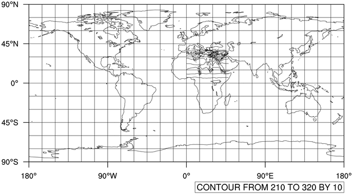
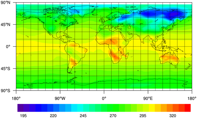
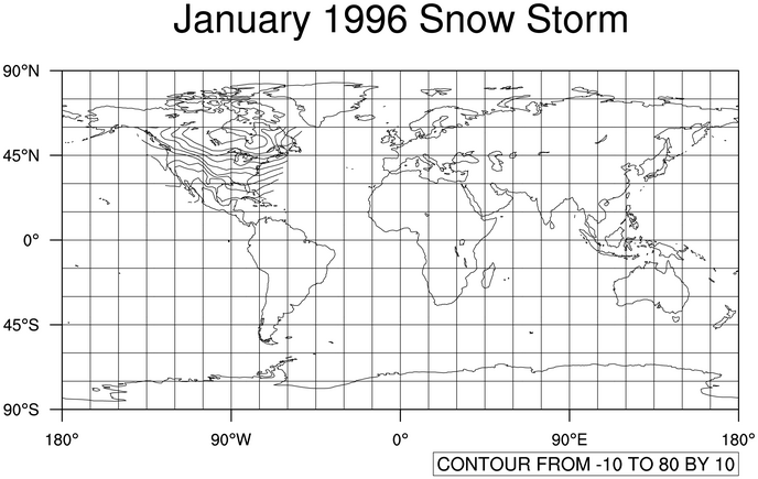
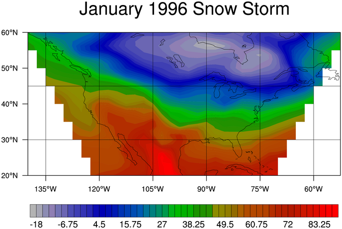
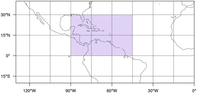
Contours over maps exercises (set 1)
- To draw your contours over a map,
call Ngl.contour_map instead of
Ngl.contour. This function defaults
to a cylindrical equidistant map projection. Again, the contours will
not be in the correct location. This is because we haven't given the
function any latitude/longitude information yet.
[Answer script] [Image]
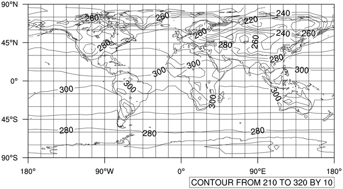
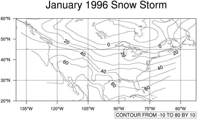
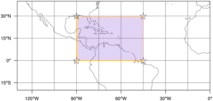
- If you add a "print(tf)" to your
script, this will print information about what's on the netCDF
file. You'll see that it contains a "lat" and "lon" array. Use
these arrays as values to the two scalar field
resources sfYArray and
resources sfXArray
[Answer script] [Image]
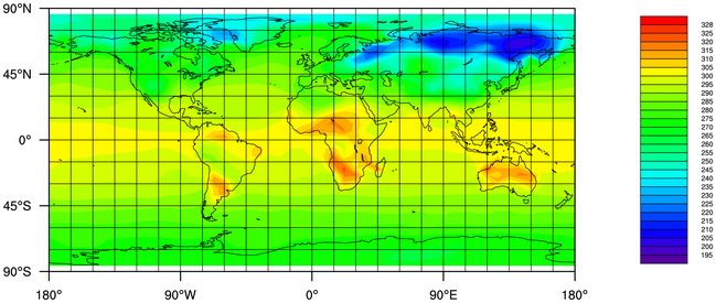
- Most of the resources used for this
example were discussed in the contour
plot exercises section above.
[Answer script] [Image]
- Most of the resources used for this
example were discussed in the contour
plot exercises section above. You want to use a mix of PlotManager
and LabelBar
resources
[Answer script] [Image]
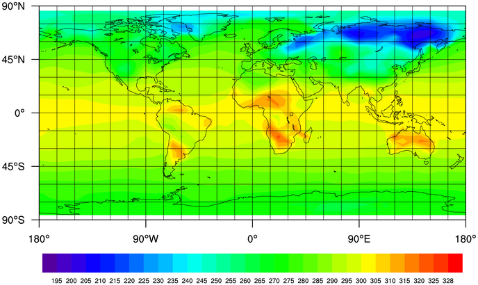
- By default, lbLabelAutoStride is set to True (it's False
for NCL). To override this and control the number of labels on the
labelbar yourself, look for another LabelBar
"Stride" resource.
[Answer script] [Image]
- First, you will need to add "tan" to
your color map using Ngl.new_color.
You can look at the named color tables to find a
tan color you like. Then, look up this named color in the rgb.txt file. Divide the three numbers
by 255 to get the RGB triplet to use.
Make sure that this new tan color is not used in your contour colors, by setting the special nglSpreadColorEnd resource.
To control the color of land and ocean, you can use individual resources like mpLandFillColor and mpOceanFillColor, but it's easier to use the single resource mpFillColors. Set the land color part of this resource to -1 make it transparent.
To control the draw order of various aspects of a plot, check the resource list for that object for "DrawOrder" type resources. These can be set to "PreDraw", "Draw", or "PostDraw" in order to control which phase certain objects are drawn in.
[Answer script] [Image]
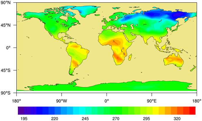
Contours over maps exercises (set 2)
- Use scalar
field resources to set the lat, lon arrays, and
the missing value.
[Answer script] [Image]
- There are several ways to zoom in
on a map. See the documentation for mpLimitMode for more information. The
most common limit mode is "LatLon".
[Answer script] [Image]
- Most of the resources used for this
example were discussed in the contour
plot exercises section above. Note that in this case, we are not
setting a minimum or maximum contour level; we are only setting the
spacing. This is possible when you use a cnLevelSelectionMode setting of
"ManualLevels".
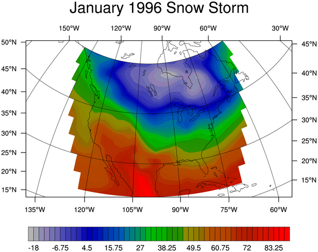
[Answer script] [Image]
- Use the mpProjection resource to change the map
projection. The map projection may not look right, so you need to
change the center latitude and longitude values.
[Answer script] [Image]
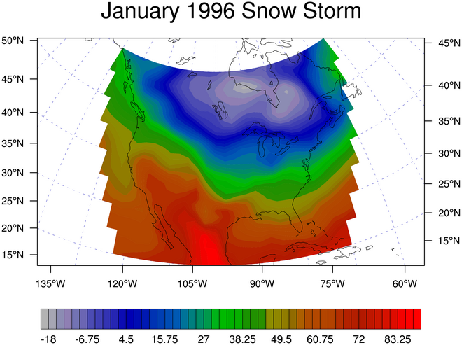
- The map resources of interest here
all start with "mpGrid". To turn off the top tickmarks, look at
tmXTOn.
Turn off the top tickmarks.
[Answer script] [Image]
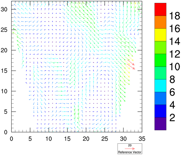
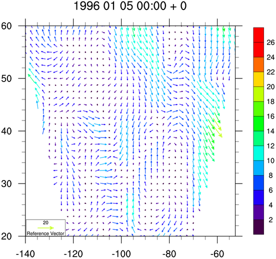
Vector plot exercise hints
- Making the vectors multi-colored
involves the use of one of the "vcMono" resources.
[Answer script] [Image]
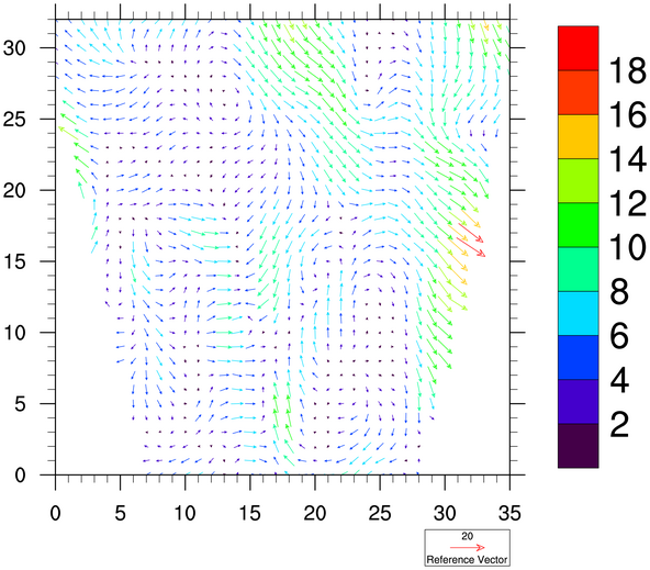
- Changing the reference magnitude is
probably one of the most common things you'll want to do to a vector
plot. Check out the vcRefMagnitudeF resource as a start.
[Answer script] [Image]
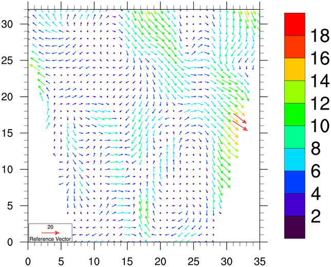
- Use Ngl.define_colormap to change the color
map. The nglSpreadColors resource is
already True by default, so the full color map will be spanned. See
the contour exercises above to see how to span only certain sections
of a color map.
[Answer script] [Image]
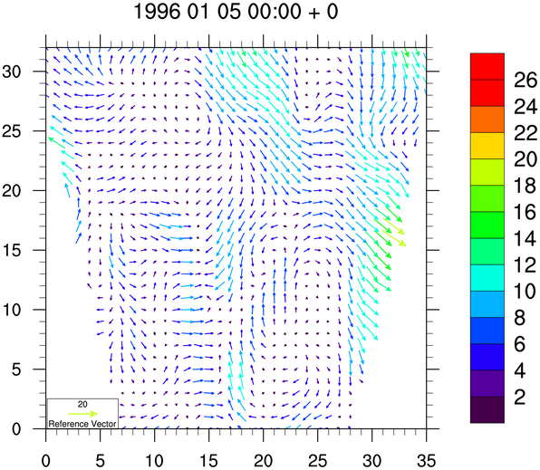
- Moving the reference annotation box
involves the use of a vector orthogonal resource to move
the box up and down, and a parallel resource to move the box left
and right. Generally you have to use trial and error to get
the box where you want it.
[Answer script] [Image]
- The
default "mode" for setting vector levels is "AutomaticLevels",
where PyNGL tries to pick "nice" levels based on the magnitude
of your data. In order to set the levels yourself,
see the vcLevelSelectionMode
resource.
Use tiMainString to change the title.
[Answer script] [Image]
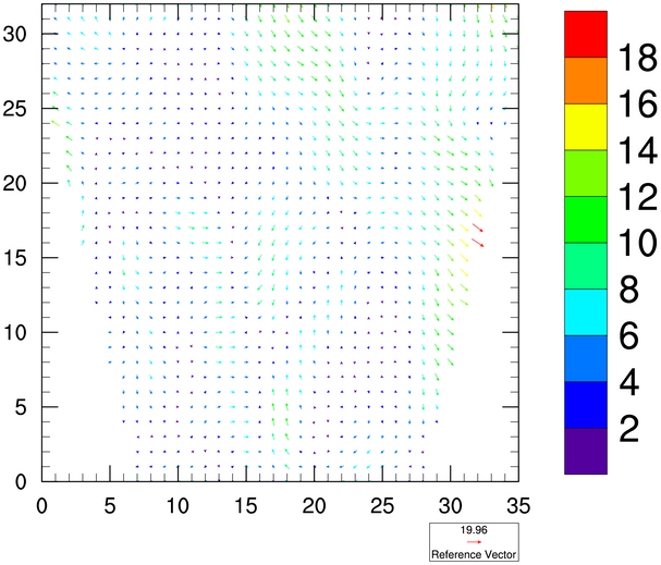
- Just as you
use scalar
field resources for a contour plot, you can
use vector
field resources for a vector plot.
Use PlotManager and LabelBar resources to change the size of the labelbar and the labels.
[Answer script] [Image]
- There are 64 timesteps on the file.
Instead of going to an "x11" window, then, it might be better to go to
an NCGM file and use idt to animate the
NCGM file.
Use the "all" function to test for all missing data.
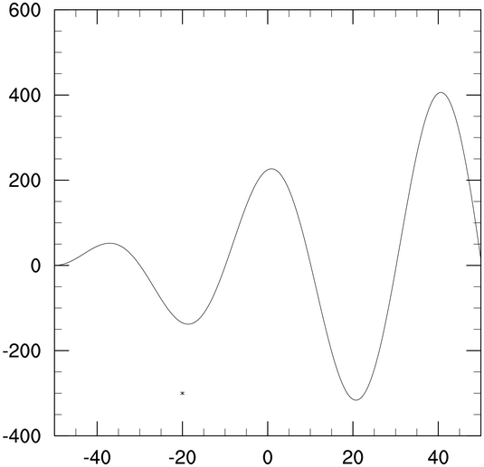
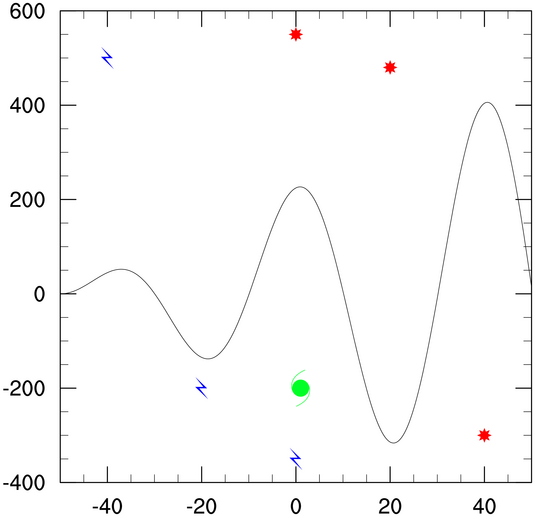
Primitives exercise hints (set 1)
- You need to set nglFrame to False so that you can draw the marker
before the frame is advanced. Use the Ngl.polymarker procedure to draw the marker
using plot coordinates.
[Answer script] [Image]
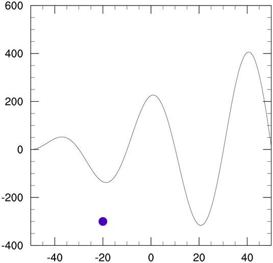
- To set some marker resources, use the
"gs"
(GraphicStyle) resources that start with "gsMarker".
[Answer script] [Image]
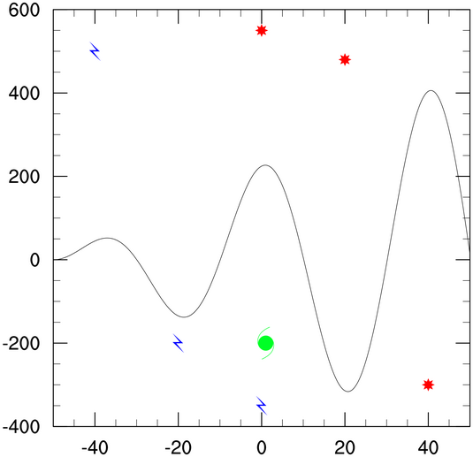
- You can use the same resource list
("mkres") to change the markers for each set that you draw. To draw
more than one marker of the same style, size, and color, pass an array
of X and Y values to Ngl.polymarker.
[Answer script] [Image]
- This exercise produces the exact same plot
as the previous exercise, only using Ngl.add_polymarker instead of Ngl.polymarker. When you use any of the
"Ngl.add_polyxxx" functions, you must use a unique
variable on the lefthand side for each call.
You should also turn off the initial drawing of the plot and draw the plot manually after you add the markers.
[Answer script] [Image]
Primitives exercise hints (set 2)
- Use the Ngl.add_polyline function to add the lines
using lat/lon coordinates. You need to set nglFrame to False so that you can draw the map
with the attached lines before the frame is advanced. To set some
lines resources, use the "gs"
(GraphicStyle) resources that start with "gsLine".
[Answer script] [Image]
- Use the Ngl.add_polygon function to draw the
polygon. You can use the same lat/lon coordinates that you used for
the box lines. To set polygon resources, use the "gs"
(GraphicStyle) resources that start with "gsFill".
[Answer script] [Image]
- See the "DrawOrder" resources in the list
of map
resources for a way to change the drawing order of the
outlines and grid lines so they get drawn before the polygon is
drawn.
[Answer script] [Image]
- As with the above exercise, you can use
"gsFill" resources to change the fill pattern and color of your
polygon. Click here to see
a table of the available fill patterns.
[Answer script] [Image]
- Use the Ngl.add_polymarker function to add the
polymarkers. Note that when you use the "Ngl.add_xxx"
functions, the variables on the lefthand side must be unique, and they
must not be deleted.
[Answer script] [Image]
- Use the Ngl.add_text function to add the text. The
text resources start with "tx"
(TextItem). Again, the variable on the lefthand side must be unique.
[Answer script] [Image]
Primitives exercise hints (set 3)
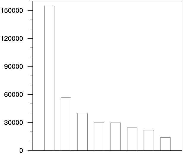
- As mentioned, you want to use Ngl.xy inside a loop to draw each bar. This
is a bit redundant, because the axes and tickmarks will get redrawn
each time. Since we are only drawing eight bars, it's not too bad
timewise.
You will need to set the special resource nglFrame to False so you can draw each bar before the frame is advanced. Add a call to Ngl.frame after the loop to make sure the frame is advanced properly.
[Answer script] [Image]
- Use tm
resources to turn off the tickmarks for a particular axis.
[Answer script] [Image]
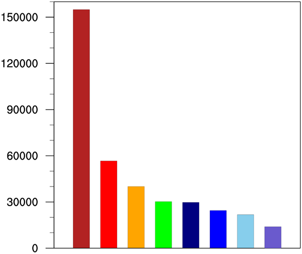
- Use Ngl.define_colormap to define a color map, and
Ngl.polygon to draw a filled polygon.
Use a GraphicStyle resource to set the polygon fill color.
[Answer script] [Image]
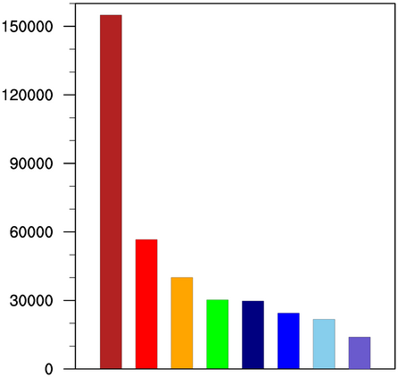
- Use a viewport
resources to control the location and size of the plot.
Since the special resource nglMaximize
is set to True by default, it will recalculate the viewport resources.
Set this to False so you can change the viewport resources yourself.
[Answer script] [Image]
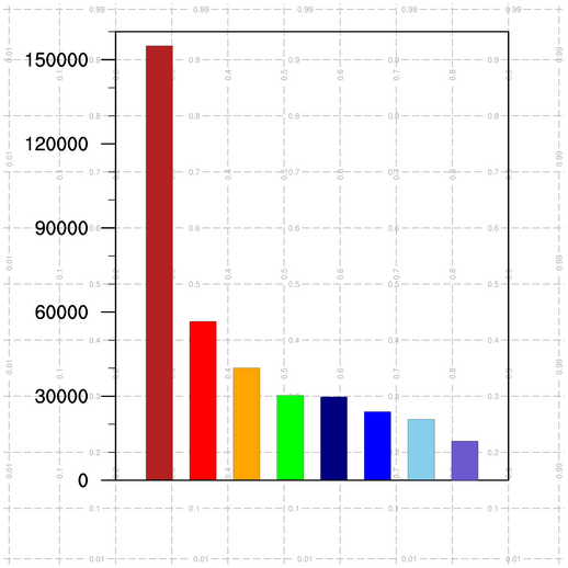
- Whenever you want to add polylines,
polymarkers, polygons, or text ("primitives") outside of the plot
area, you can call Ngl.draw_ndc_grid to
draw vertical and horizontal lines at various NDC values. This will help you
determine what NDC values to use for your primitives.
You want to call Ngl.draw_ndc_grid before you advance the frame. You can call it before or after you draw a plot, depending on whether you want the lines drawn under or on top of the plot. For this exercise, draw the grid before you draw the plot.
[Answer script] [Image]
- Use the function Ngl.polyline_ndc to draw a box using NDC
values. For changing attributes of the lines, use GraphicStyle
resources that start with "gsLine".
[Answer script] [Image]
- There's not much different with this
script from the previous script, except that each box should be drawn
inside a python "for" loop.
[Answer script] [Image]
- Use the function Ngl.text_ndc to draw text strings in NDC
space. Text resources start with "tx".
The default is to center each text string about the X,Y position, so to left-justify it, you need to set the txJust resource.
[Answer script] [Image]
- The default line color is the foreground
color (black in this case), so there's no need to set any resources
for the Ngl.polyline_ndc call. It
works better if you draw the polylines after the polygons, so the
polylines are not obscured by the polygons.
[Answer script] [Image]
- Use tmYMajorGrid
resources to turn on and change horizontal grid lines for the major
tickmarks.
Since there's no way to turn tickmarks off, you turn them off by setting their lengths equal to zero (see tmYLMajorLengthF for a start).
[Answer script] [Image]
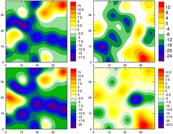
Paneling exercise hints
- To create an array of plots,
create an empty list and use the "append" method
to append each plot to the array as you create it.
To make sure each dataset is unique, you can use a different seed in the Ngl.generate_2d_array function.
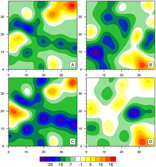
[Answer script] [Image] (only first image shown)
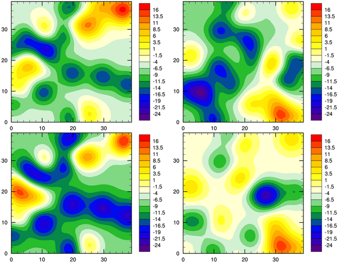
- Use the Ngl.panel to panel the individual plots.
[Answer script] [Image] (only last image shown)
- The nglDraw
and nglFrame resources control the
drawing of the individual plots.
[Answer script] [Image]
- See the resource cnLevelSelectionMode.
[Answer script] [Image]
- This example also
uses the cnLevelSelectionMode
resource, but sets it to a different value.
[Answer script] [Image]
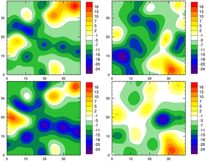
- To turn off individual labelbars, see
lbLabelBarOn. To turn on a common
labelbar in a panel plot, see nglPanelLabelBar.
[Answer script] [Image]
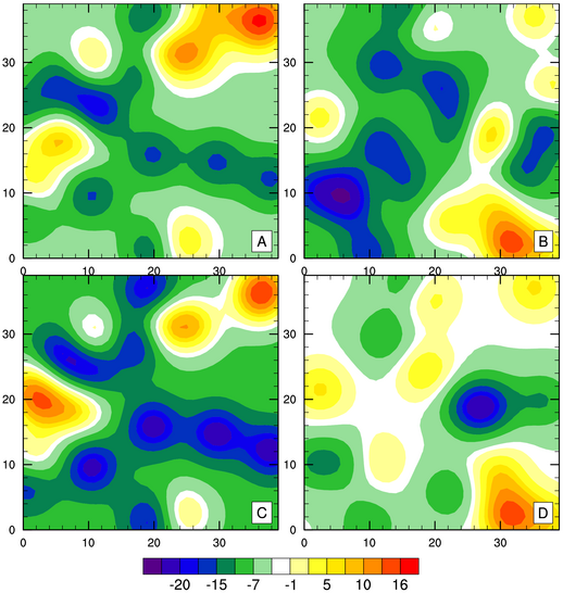
- See the resources
nglPanelFigureStrings and
nglPanelYWhiteSpacePercent.
Note there is a similar resource for white space in the
X direction.
[Answer script] [Image]
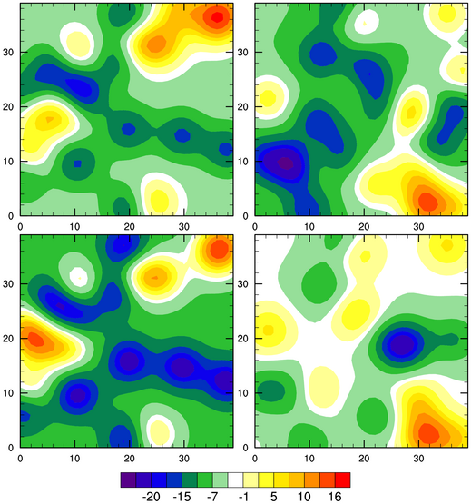
- To turn off tickmarks, you need to
set tickmark resources for the individual plots. See
tmXTOn and
tmYROn.
[Answer script] [Image]
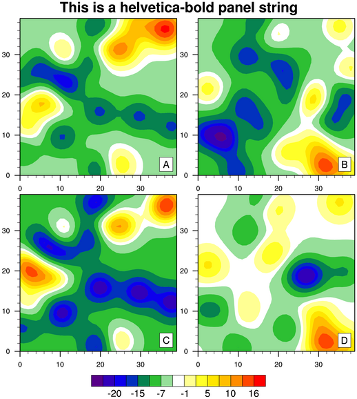
- To add a main title, use the Ngl.text_ndc function to draw a string in NDC space. Since there is no room for a
title, you will need to make room by using the special nglPanelTop resource (for future reference, there
are corresponding Bottom, Left, and Right resources as well).
You can use a function code to change the font. See the font tables to find a bold font.
[Answer script] [Image]